Rachel Purcell

(01) The brief
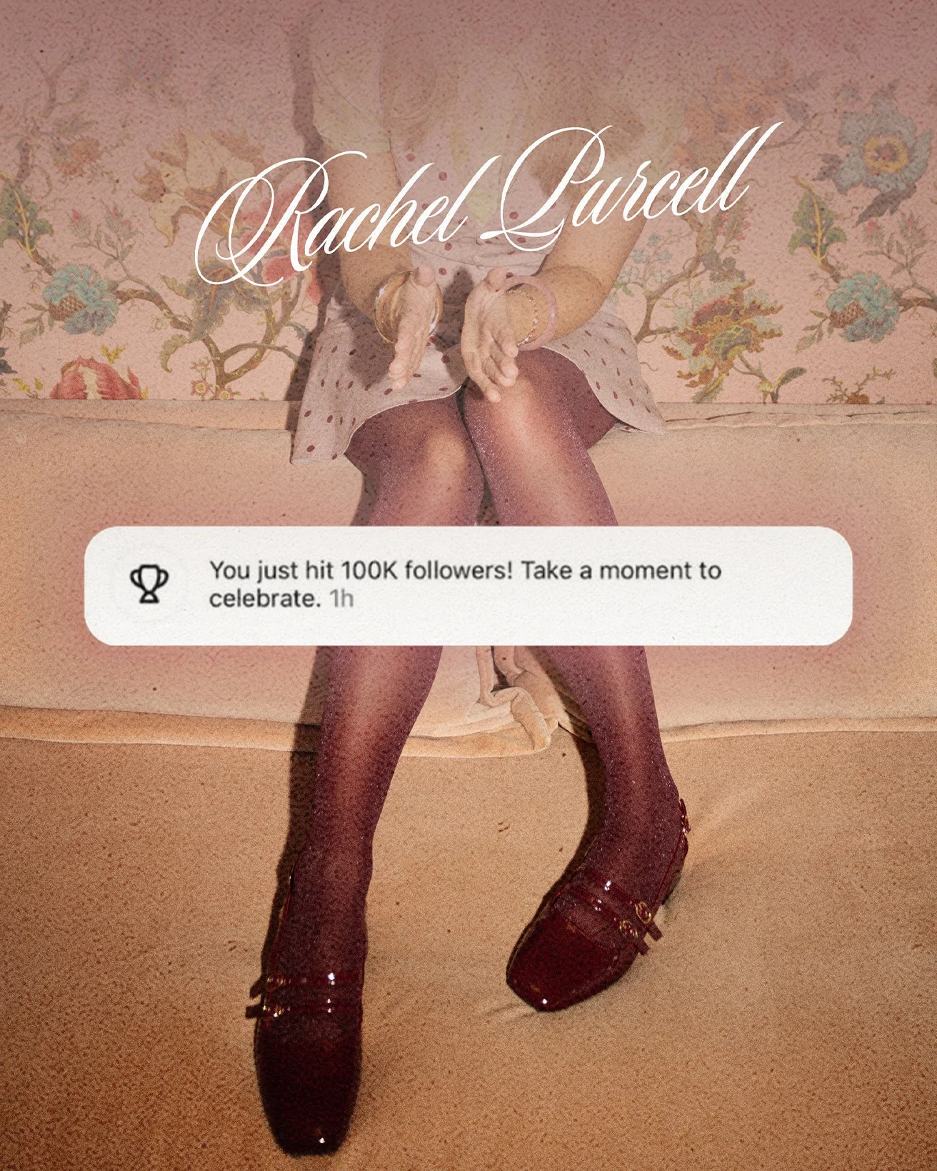
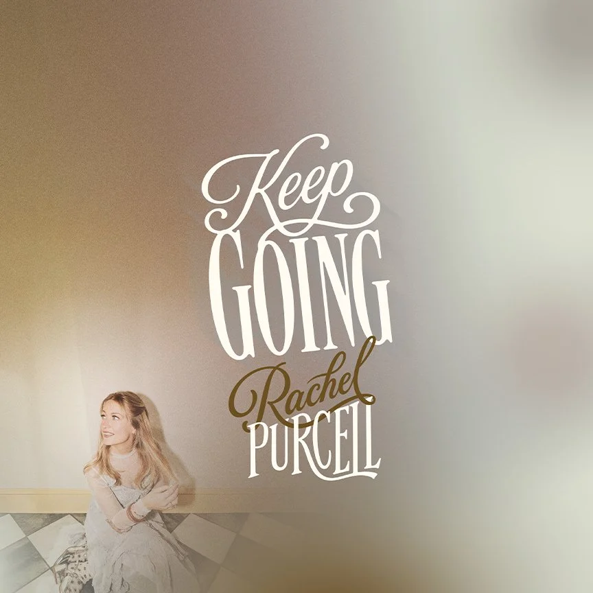
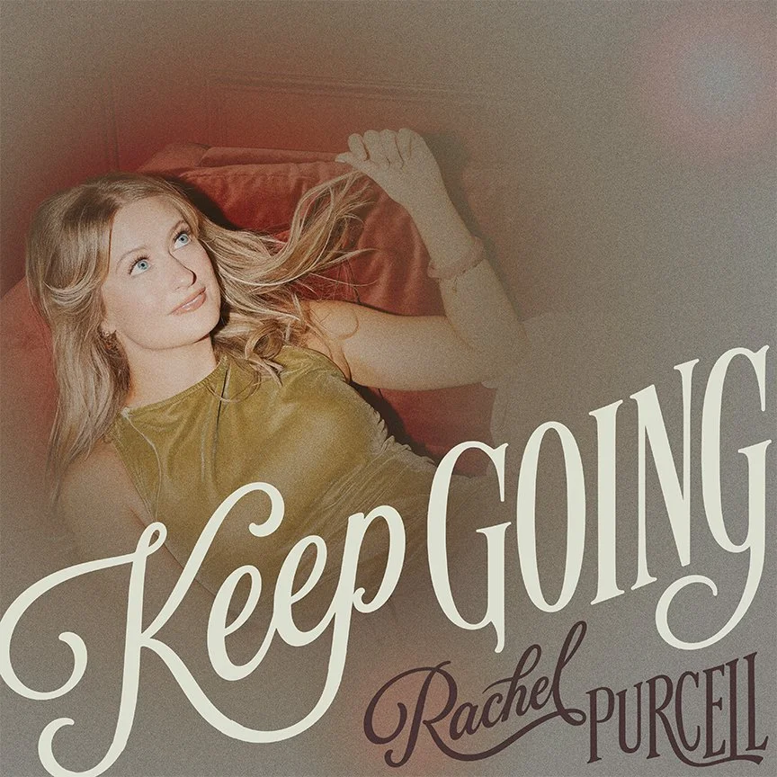
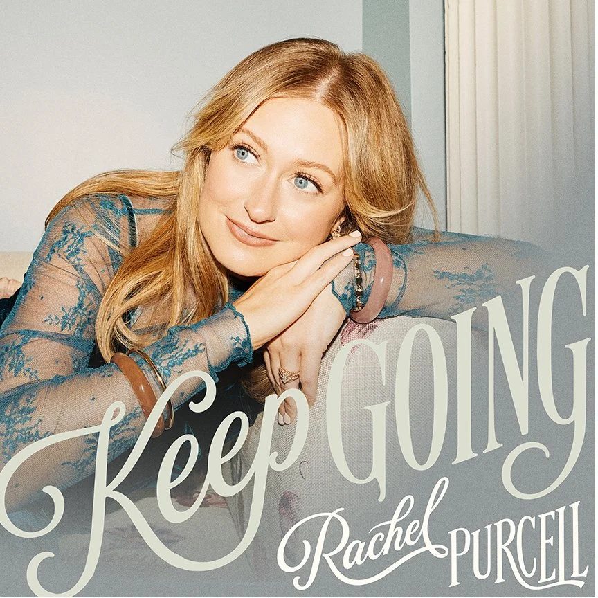
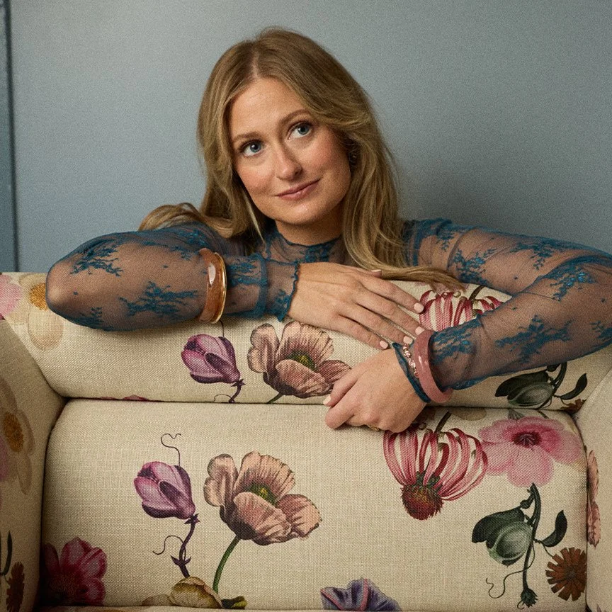
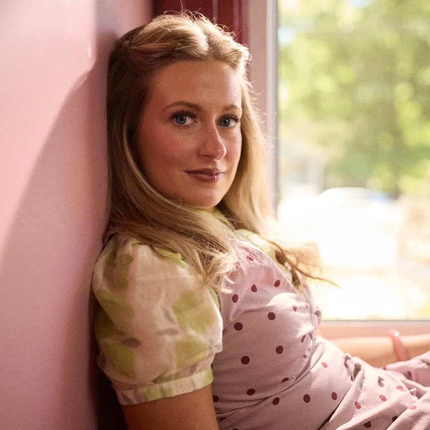
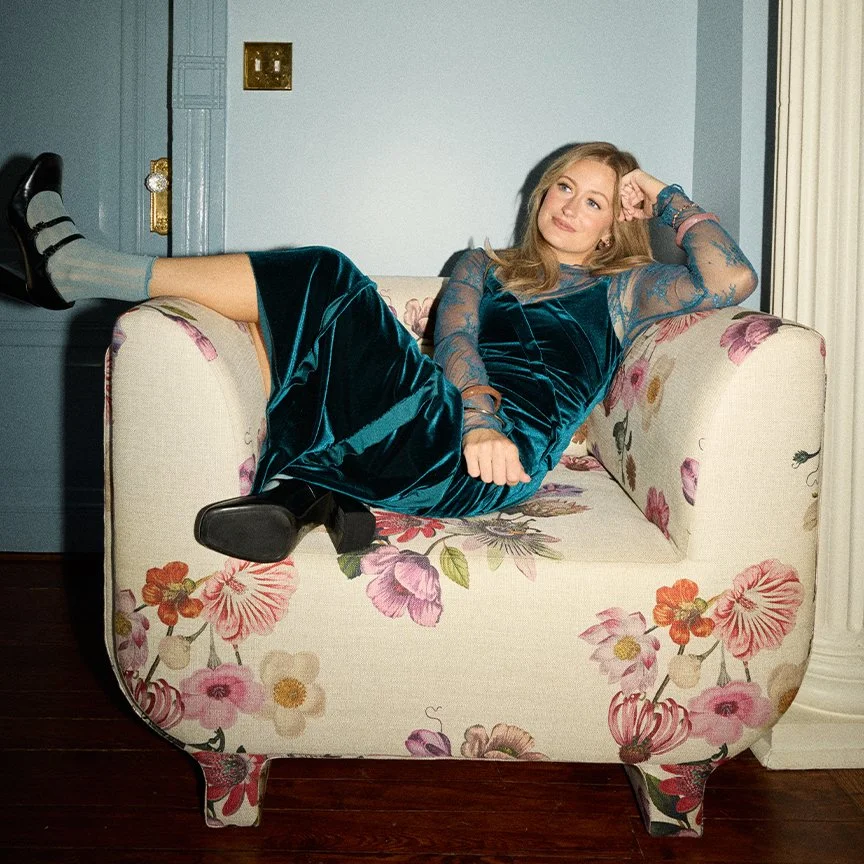
Rachel’s evolving sound presented an opportunity to rethink her visual identity and push her creative world in a new direction. I wanted to move beyond the expected conventions of artist branding and create something more expressive, atmospheric, and distinctly her own. A visual identity that could stretch across releases, photography, and digital campaigns without losing its point of view.
(02) The idea
My direction leaned into a fresh, editorial approach to artist branding, pairing cool, understated color with expressive typography, natural styling, and thoughtfully composed photography. I wanted to create a visual identity that felt modern, effortless, and distinctly personal, with a balance of personality and restraint that could evolve across releases and campaigns. The concepts shown here reflect the creative direction I proposed for the project. While they weren’t ultimately brought to life, they represent the visual world I envisioned and the creative territory I wanted to explore.

(03) Outcome
The project included creative development across artist branding, photography, release artwork, and digital campaigns. I developed a distinct visual direction, exploring multiple concepts and applications for a cohesive artist identity. The work featured here represents my original creative explorations and proposed direction; it was not ultimately selected or implemented and does not reflect the branding currently used by the artist.
Credits
Creative direction — Meg Breor
Photography — Mary Caroline Russell
Centricity Music