Band Reeves
(01) The brief
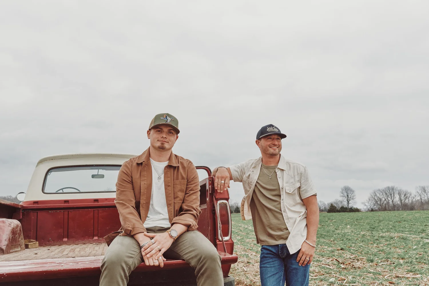
When Band Reeves first came to us, they were an emerging independent artist without an established visual identity. The opportunity was to build a recognizable world around the band—one that could grow with them across releases, photoshoots and touring as their career evolved from independent beginnings to a signed artist.
(02) The idea
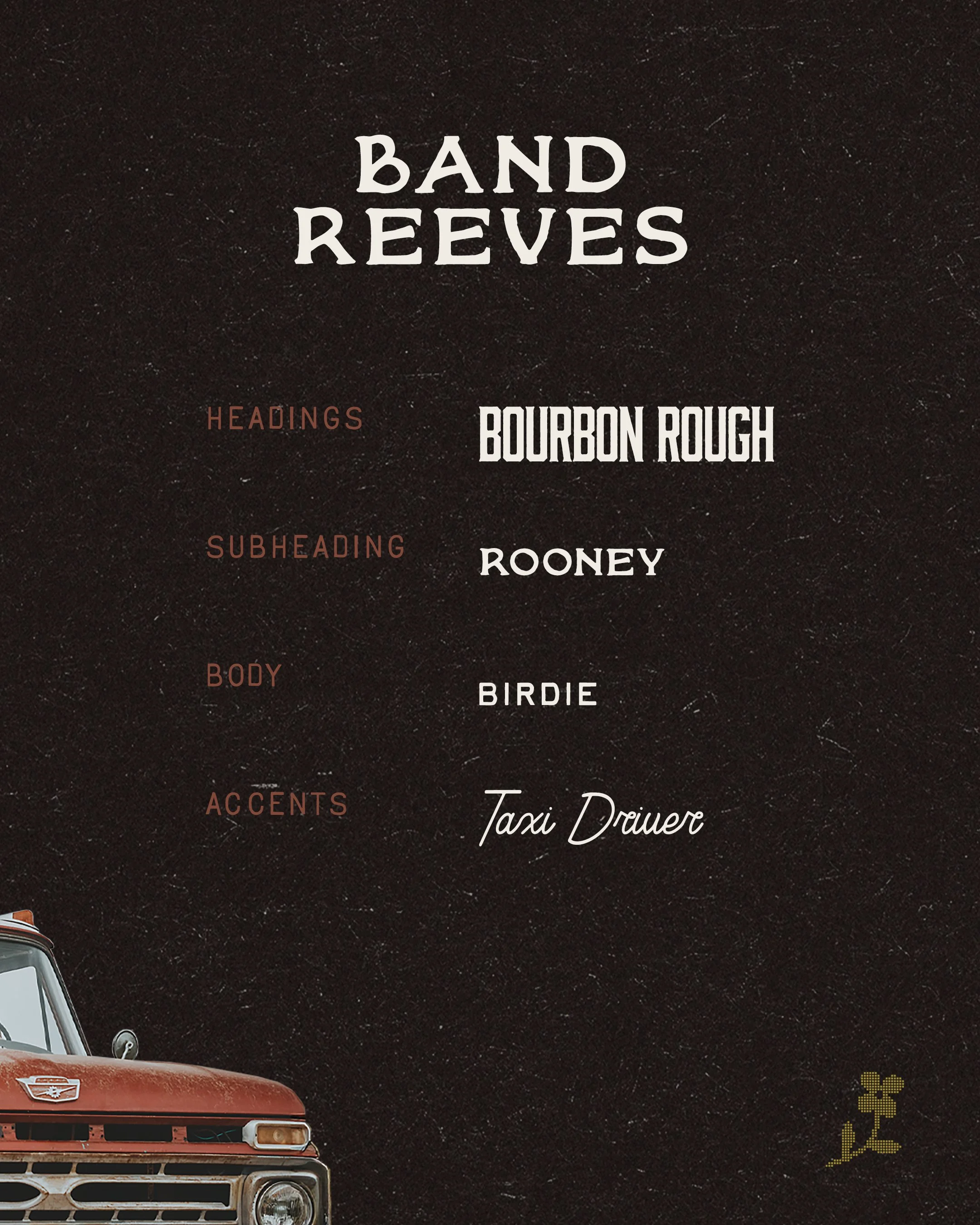
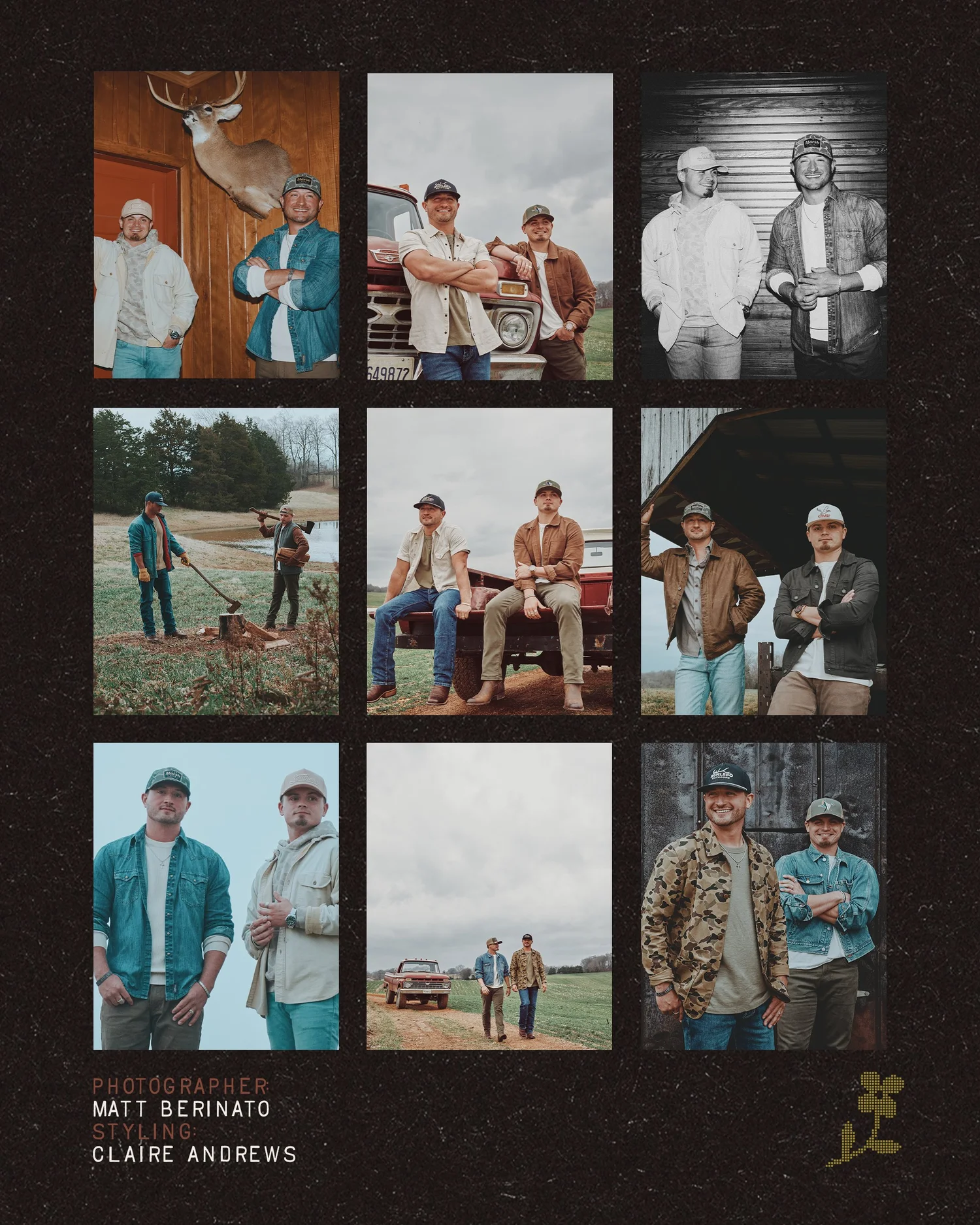
Rooted in country music and the contrast between small-town beginnings and big-city ambition, the visual identity draws on a familiar Americana sensibility with room to evolve. Typography, color, texture and photography work together to create a world that feels lived-in, distinct and unmistakably theirs. Across each release and photoshoot, we built on that visual language, giving the band a cohesive identity that could grow with them without losing sight of where they came from.

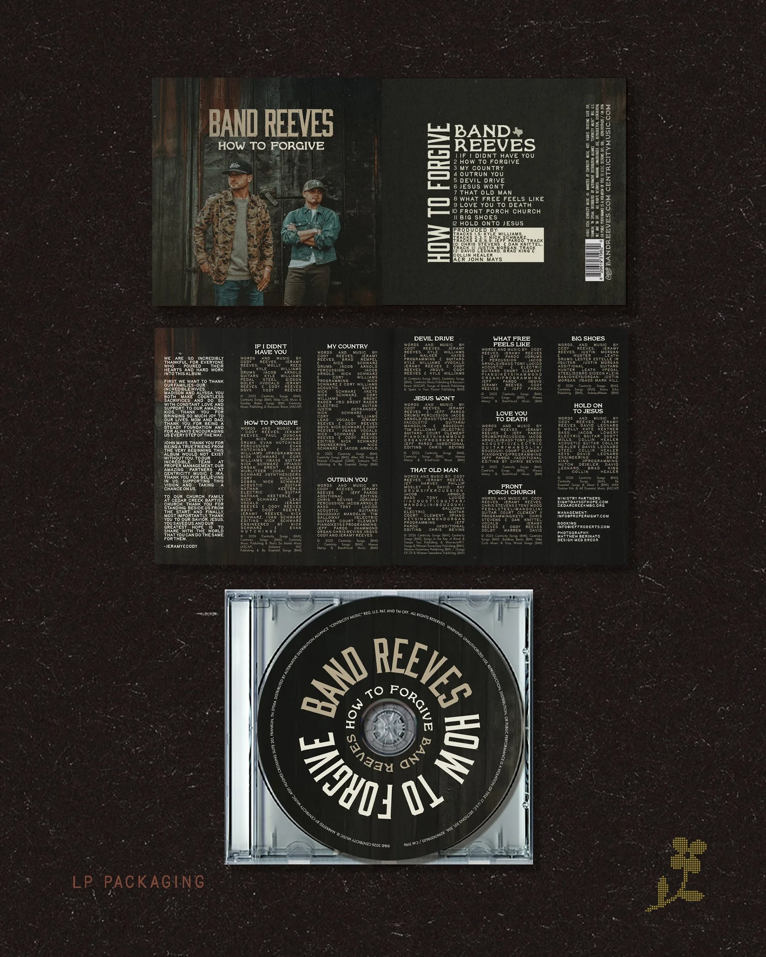

(03) Outcome
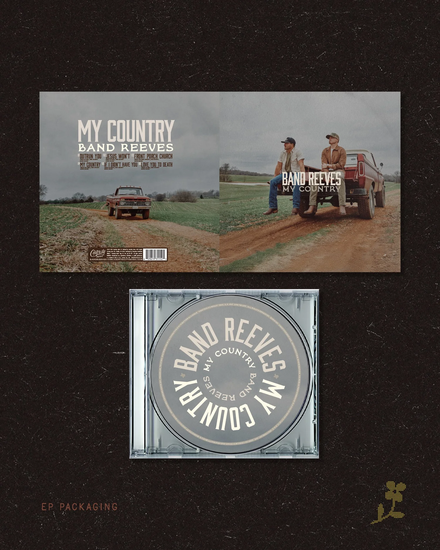
The visual identity carried Band Reeves from their early independent releases into their first EP as signed artists, My Country, and eventually their debut LP, How to Forgive. Along the way, the band expanded their live presence, landing spots at multiple festivals and earning a recurring place on Ben Fuller’s Black Sheep tour. What began as building a visual foundation for a new artist became an identity that grew alongside the band and their career.
Credits
Creative direction — Meg Breor
Photography — Matthew Berinato
Wardrobe styling — Claire Andrews
VP of creative — Joshua Wurzlebacher
Content creator — Spencer Kane
Talent management — Proper Management